13 July 2020
In 2020, we are more conscious than ever of our health. Wearing masks, keeping our distance and washing hands non-stop have become a part of our daily lives in a way that would have been inconceivable just months ago.
Evidence is emerging that COVID-19 is more deadly for some parts of society than others, and it is difficult to unpack which characteristics suggest a greater risk. The elderly are certainly worse affected than the young; however, underlying medical conditions that appear to heighten the severity of COVID-19, such as cardiovascular disease, are also much more prevalent in the elderly.
The multivariate analysis that is needed to separate confounding factors such as these relies on large samples of high-quality data. This aligns very well with Club Vita’s core business, as much of our longevity research is performed to understand how longevity differs by different types of people.
Club Vita is committed to providing research and tools to stakeholders interested in the health and financial security of our seniors. Today we are publicly releasing an interactive map that illustrates the level of life expectancy of Canada’s retirees depending on where they live. It has been created by analyzing the longevity experience of 750,000 defined benefit pensioners by postal code groupings. Postal code provides information on the geographic area, lifestyle, affluence and socio-economic status of those who live in a community. This map can be used by pension plans, academics, insurance companies, and other organizations in Canada, to support their own analysis and research, as well as by any individual that wants to better understand the longevity of those living in their community.
For example, in cities throughout the world we have seen that COVID-19 spreads more quickly in less affluent neighbourhoods. Those in lower socio-economic groups may be less able to work from home, more reliant on public transit and living in larger households, all of which make social distancing much more difficult. This means that many of those hit hardest are those that already had lower than average life expectancy.
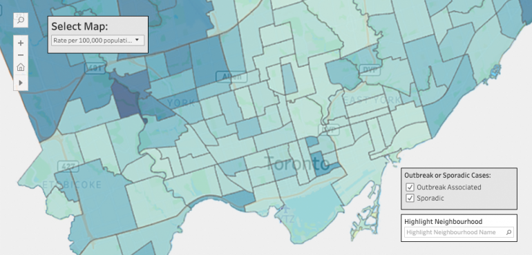
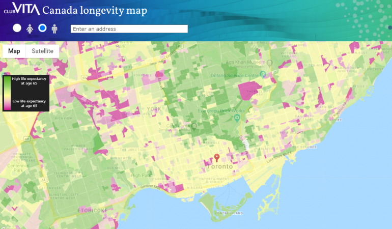
We illustrate this example in the two maps below. The first map shows COVID-19 infection rates1 by Toronto neighbourhood, with darker colours indicating higher infection rates . The second map shows life expectancy by neighbourhood2 based on Club Vita’s postal code-based analysis, with areas of lowest life expectancy shaded in pink and those with highest life expectancy shaded in green.


In both maps we see greater risk of infection / death in the north-west and eastern parts of Toronto. The stark differences between some neighbourhoods in the Club Vita longevity map suggest a more granular approach may be beneficial to enable a better understanding of COVID-19.
When considering how long people will live, it is now more important than ever for stakeholders, including pension plans and insurers, to dig deeper into the data. Pension plan members in Canada tend to be more affluent, on average, than the general population, so the short-term increase in death rates might be less than for the country as a whole. Pension plans also vary widely in the socio-economic distribution of their membership, and relying on high-level generalizations, like public versus private sector, when analyzing longevity (which is currently quite common in Canada) ignores the specifics of each plan.
You can see this map, and search anywhere in Canada using postal code and address, at maps.clubvita.ca. (The maps can be viewed based on males or females). And, if you are interested in our neighbours south of the border, we also have a US map available at maps.clubvita.us.
Undoubtedly, we are in the midst of a time of significant uncertainty, even about how our future daily life will compare to that of the past. This has, in turn, magnified the uncertainty of future longevity. Club Vita looks forward to continuing to share longevity insights and tools to help enable a better understanding of longevity and the ability to manage longevity risk.
If you have any questions about our longevity map(s), please contact Richard Brown.
1COVID-19: Status of Cases in Toronto – Toronto Neighbourhood Maps (as of June 2020)
2 Neighbourhoods are represented by dissemination areas, which are a Statistics Canada geographic unit that generally cover a population of 400 to 700 people.


